
Mapping the Customer Journey to Redesign a Household Product Company’s Digital Platform
Overview
This case study describes how the Wizeline design team facilitated and executed a major design solution for Custer. (To respect our customer’s wishes to remain anonymous, we are using “Custer” as a pseudonym for the brand.) The company was founded in Europe more than 50 years ago and is internationally recognized for its high quality and innovation in household products.
This project involved multiple phases and included in its scope comprehensive stakeholder and subject matter expert interviews, design thinking workshops, concept testing, architecture definition, and design of the most critical flows, as well as a style guide with design recommendations applicable to any part of the platform.
Project Summary
- Scoped as an 8-week project
- We had a robust team of four UX designers with facilitation skills to lead collaborative exercises, plus research training that allowed them to moderate internal and external interviews and proofs of concept. The team also included an interface designer who worked on the style tiles and implementation of the UX recommendations while the rest of the team worked on the strategy
- The project included a project manager, a technical writer, 15 developers, and delivery staff who were responsible for handling client-side relationships
The Challenge
As part of its digital transformation, Custer created CusterDigital, a mobile and desktop platform that allows every physical operation to be done digitally. For instance, making order requests and showcasing new products.
The main challenge the client had identified was onboarding a larger number of sellers, as only one-third of them were using the platform at the start of the project.
For context: Sellers submit their requests to distributors, who then authorize them and obtain the products. Most of the distributors were already using the platform, and it was unclear why so few sellers were leveraging it.
Custer approached Wizeline with the need to collaboratively design the next version of CusterDigital not only to increase adoption, but also to comply with multiple business rules, regulations, and intervening areas. They specified that at least four departments had a stake in the success of the platform: Commercial, IT, Operations, and Marketing.
Internal Alignment Validation
Our UX team identified the company’s key internal stakeholders and conducted in-depth interviews with each of them. We captured all of their statements, synthesized them, and color-coded them. As a result, patterns emerged and we were able to see which topics were most prominent.
Questions on the interviewer’s script included:
- What’s your current vision for this project?
- What kind of digital experiences do you have in mind?
- Are there any technical limitations we should be aware of?
- What business objectives are being promoted by this platform?
Custer stakeholders map and color-coded findings. Yellow and blue are the most prominent topics: platform performance and user experience, respectively.
By consulting our synthesis, all members of the Custer team were able to understand their strongest points of alignment as well as their different priorities. This generated healthy conversations about the strategic purpose of the redesign.
Topics included vision, context, user goals, brand identity, and design process.
We discovered that stakeholders were under the impression that the issue of low seller adoption rate was primarily caused by poor user experience and sluggish platform performance.
In addition to bringing about improved alignment, our methodology for interviewing stakeholders allowed our designers to become more familiar with the client’s industry terminology. This way, when it came time to conduct workshops, the design team was entirely familiar with the core concepts to be discussed.
Conducting a Remote Workshop Unexpectedly

During the critical beginning of our scheduled design thinking workshop, the COVID-19 pandemic arrived in Mexico. Suddenly, the team was unable to physically facilitate the exercises in Wizeline’s UX Lab or in Custer’s offices. While this was a surprise, it was not the first time our team had facilitated a workshop remotely, and we took advantage of learnings from similar previous experiences. We made sure the following was done in addition to what was already planned:
- Enabling the stakeholders to use our virtual sticky note-handling platforms
- Establishing ground rules for online discussion behavior, which included outlining good microphone etiquette and requesting participants’ full attention
- Training our participants to communicate through video conferences and screen sharing
- Innovating our own internal creative processes so we could structure information architecture and screen layouts without a physical whiteboard
Section of CusterDigital Experience Canvas.
The exercises we conducted with the client included the following:
Warmup: The team led a fun game to start the workshop off on an engaging, positive note as people practiced and became fluent in using our communication tools before having to make any critical decisions.
Experience Canvas: This exercise was designed by a reputable and innovative design thinking company called Atlassian. Its purpose was to clarify the problem, plus the stakeholder’s assumptions about who the user was and what success looked like. Since we had already interviewed each one of the stakeholders separately, we prefilled the canvas and only left blank the sections that needed further clarification or completion. This saved a lot of time for everyone involved.
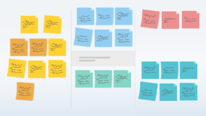
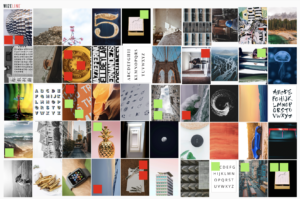
Brand distillation: This exercise developed by the Wizeline visual design team enabled us to absorb the terminology the client used to describe the most and least desirable aspects of Custer. A discussion was created around pictures that the participants chose to represent what a good day vs. a bad day at Custer looked like.
Custer brand distillation: Green sticky notes represent positive brand attributes and red ones, negative attributes.
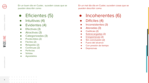
Patterns found.
Proto-persona: By focusing on the stakeholders’ understanding of their users’ context, needs, pain points, and goals, we collaboratively created three profiles for each of their most important roles. We based the profiles on their assumptions, but we also had user research planned to help us validate them.
Afterward, we created a list of questions to ask our real participants when we spoke with them over the phone. This way, we made sure all of the stakeholders’ questions about their users’ context would be answered during user research.
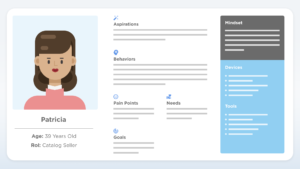
Patricia, a seller (proto-persona).
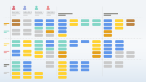
Customer Journey Map: This is a visual representation that chronologically showcases every interaction users have had with a company. It allowed the participants to identify the most critical touchpoints.
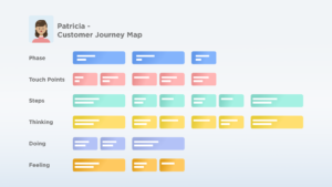
Section of a seller customer journey map.
Risky assumptions identification: We presented a sitemap of the current platform to our participants and asked them to vote on the riskiest sections based on what had been discussed up to that point, along with certain implied assumptions. For instance, if a section was supposed to be used on the street while sellers were moving door to door, and data needed to be uploaded or downloaded, it was assumed that a significant portion of the sellers had mobile data.
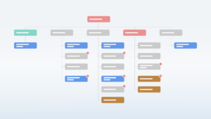
Risky assumptions identification – sitemap and votes.
Time to Look Outside
After diving so deep into our client’s understanding of their users and their context, it was time to “get out of the building.” Telephonically, we interviewed 10 real users, all of whom had passed our participant screening process to confirm they belonged to our user profiles.
We created a moderator script in which we asked their permission to record the conversation, then explored specifics from our previous work (Proto-persona, e.g. Why do you use CusterDigital?; Customer Journey Map, e.g. How do you capture your orders for the distributor?; Riskiest assumptions, e.g. Do you use the “electronic order requests” section? What for?). We finished by asking a few further questions about their expectations for the platform and inviting them to share any ideas for possible improvement.
We scheduled one hour to speak with each participant, but we had enough questions to fill about an hour and a half. Our moderators were ready to select the most pertinent questions on the fly to make the conversation flow naturally.
The amount of information gathered throughout 10 hours of interviewing was too large to synthesize without a visual method, so we again classified all of their statements with a color code to reveal the most prominent topics.
User interview statements are color-coded.
It was evident that some of the strongest user concerns were related to the platform performance (red) and the platform user experience (green). These findings were aligned with the stakeholders’ perceptions and provided empirical evidence to confirm their suspicions.
Hey, Seller: What Do You Think?
Our last research step before moving on to design execution was testing a new concept to get some real user feedback before we began building.
We created an interactive prototype of a section of the platform, with hypothetical data and imaginary products to represent a different experience that still addressed the most critical issues we had identified.
As part of our moderator script, we explained that we would take a video of the participant’s screen and record their voice for the explicit purpose of improving the product. We also specified that we were testing the platform, not them; this way, if they made a mistake, they would hopefully recognize that it was related to a design problem and not feel bad about it.
We also let them know that if they said good things about the platform, they would not flatter us, and if they said bad things, they would not offend us. This way, we provided reassurance that they could feel comfortable speaking candidly.
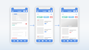
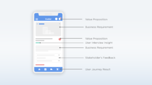
Section of the interactive prototype that was created for the proof of concept.
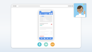
Remote proof of concept.
While this was a partial prototype (meaning it didn’t cover the entire set of user flows), the findings enabled us to extrapolate our recommendations across the whole platform and to use these users’ comments as a basis for the rest of the design execution. Key findings included:
- Users found the new navigation methods to be more comfortable and intuitive in contrast to the previous hierarchical structure
- Completion of operations in linear flows made the process quicker and easier
Landing the Plane to Build Something Tangible
Right from the beginning, we knew it would be impossible to design a platform of this size, screen by screen, in the period of time that we had been allotted. While the client initially expected descriptive and specific mockups that covered every possible scenario, they eventually realized that an alternative method was better.
If we had designed our project to cover every detail, this would have been very expensive and time-consuming for our client. After all, we would have required them to analyze and approve hundreds of screens when, in many cases, solutions were redundant, and basic rules from other sections could be extrapolated.
Instead, we decided to allow for deep discussion around the most critical flows and to create style tiles and guidelines that would explain by implication those screens which were not visually represented.
Style tiles: We created a general document that described ground rules for every design component to be created for the platform. It included, for instance, the 60/30/10 rule: 60% white space or air; 30% color, categories, or images; and 10% key actions.
Areas specified in our style tiles included: colors, iconography, typography, use of graphics support, cards, tables, containers, and notification rules.
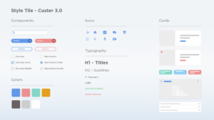
CusterDigital 3.0 style tiles.
Information architecture and flows: We developed a new and improved information architecture for each user role. In the process, we created wireframes for the most important ones.
Seller-proposed site map.
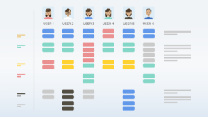
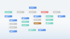
To ensure we selected the right ones, we facilitated a prioritization exercise that can be seen in the image below.
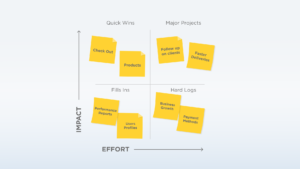
CusterDigital 3.0 flows prioritization.
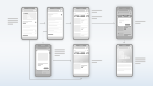
Screenflow for a critical flow.
As can be seen in the picture above, all of the design recommendations were based on a piece of evidence or strategy devised from the information we gathered.
Recommendations Lead to Yearlong Design & Development Project for Wizeline & Custer
During the final presentation, the customer was engaged and the team responded to every question, clearly connecting their business needs to how we approached the design process.
This Foundations project led to a yearlong design and development project in which Wizeline collaborated with Custer’s IT team to implement all of the design insights.
In closing, here are a few of the key findings from the latest prototype validation:
- Participants identified visual elements rapidly
- Nearly all icons were associated properly
- Incentive programs were salient
- New search bar was used properly
- New product visual presentation was accepted positively and preferred over the previous version
About Wizeline
Wizeline is a software development and design services company with operations in the U.S., Mexico, Vietnam, Thailand, Australia, and Spain. Wizeline partners with global enterprises and scaling startups to build end-to-end digital products. If you’d like to learn more, please visit www.wizeline.com or check out more case studies.
Other Case Studies
How Wizeline’s AI Academy Catalyzed Generative AI Innovation in Mexico’s First Hackathon
Read more >>

Helping a Major Media Enterprise Increase Article Visibility with a New Web Rendering Platform
Read more >>


Leveraging MLOps to Deliver Improved Predictive Analytics for a Supply Chain Analytics Company
Read more >>
Helping Etsy Migrate Its Data Warehouse From On-Premises to Google Cloud Platform With No Downtime
Read more >>