Wizeline Helps One of Mexico’s Largest Department Stores Go Digital
Overview
*To respect our customer’s wishes, we are using a pseudonym for the brand: “Retter”*
The following case study covers the re-design and development of Retter.com with a strong focus on a mobile-first approach, the challenges and learnings of working through cross-functional teams, designing for populations with device limitations, and leveraging conversion rate optimization (CRO) practices.
Project Summary
- Six-month engagement
- The design team comprised of two UX designers and a UI designer
- The project included a project manager, product owner, QA, front-end, back-end, accessibility expert, and copywriter
About Retter
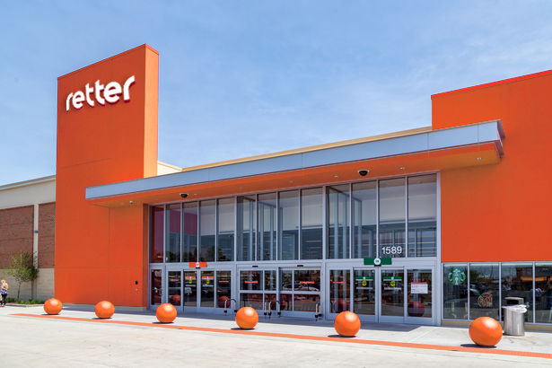
Retter is a department store founded in the 1960s. Today, the retailer has more than 1,000 stores and has become one of Mexico’s largest companies. Retter’s primary shopper demographic is middle-income families in Mexico. One of its differentiators is offering customers a credit line as one of their services via a “Grupo Retter” bank. Despite Retter’s market share and its unique blend of consumer banking and commerce, Retter has struggled to transition to digital and has relied heavily on in-person banking and retail experiences.
A Call to Adventure - Redesigning Retter.com
Retter decided to partner with Wizeline to redesign the main digital touchpoint, Retter.com, focusing on the mobile experience, representing 80% of all traffic. In addition, we wanted to present a cohesive design system that Retter could leverage to drive a consistent experience across different touchpoints and embrace a more omnichannel strategy.
The Wizeline product team assigned to the project started with discovery efforts such as:
- Stakeholder interviews: We talked with key departments including Business Intelligence, Conversion Rate Optimization, Marketing, Design, and Engineering, to assess their current state and gather insights for a future Retter.com.
- Heuristic Evaluation: We evaluated the current website UX and identified opportunity areas for usability improvements.
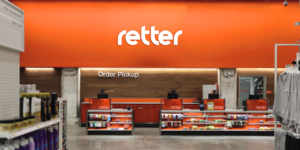
- Visits to store: We visited Retter department stores in-person to get a sense of the physical brand expression and customer shopping experience.
- Artifacts: We created journey maps and personas for the different types of customers based on their purchasing behaviors to better empathize with the target customer.
The discovery phase allowed the Wizeline product team to identify the key user flows within Retter.com and tasks to prioritize in subsequent sprints and the technical team to grasp the infrastructure’s complexity and provide recommendations for an improved tech stack.
During the discovery phase, Wizeline’s product team leaned heavily on their workshop facilitation skills to drive consensus with the stakeholders and align to move the project forward. The Retter team was not fluent in Agile and required Wizeline to act as a coach throughout.
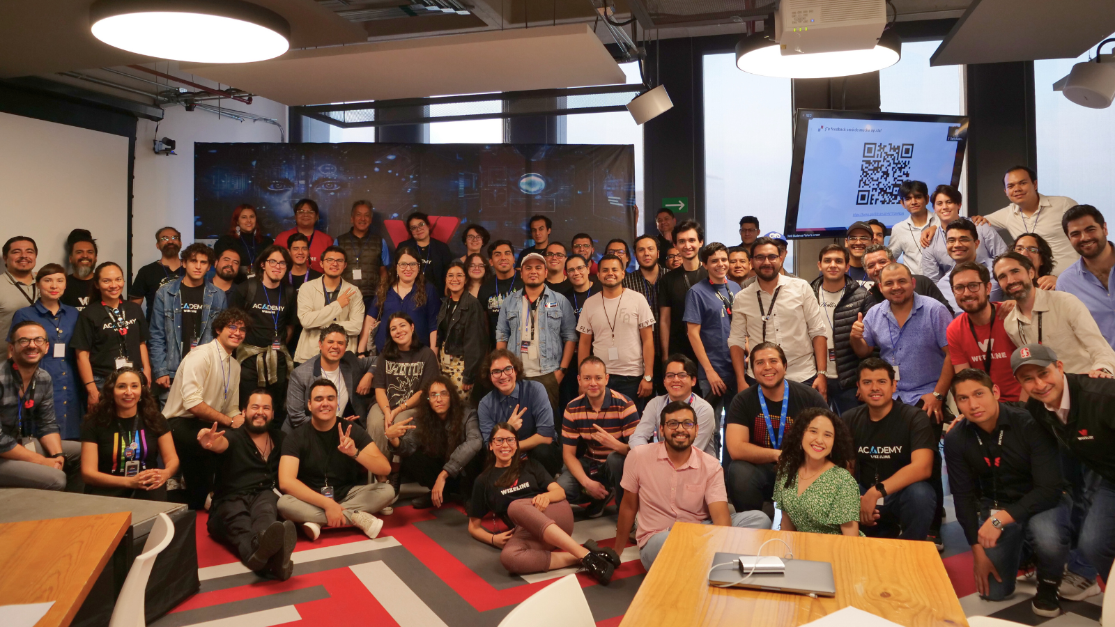
 Photo of workshop
 Photo of workshop
 Detail of heuristic evaluation
 Detail of heuristic evaluation
The Ordeal – Designing the design process
Because teams from both organizations were involved, we needed to find a cadence and workflow to make and execute decisions. We needed to balance quickly iterating and validating assumptions and remaining collaborative with Retter’s team.
We ultimately landed on a 2-sprint process:
- Review the roadmap and user story map ahead of the sprint to identify the next set of flows to work on
- Conduct secondary research to supplement existing metrics from Retter’s product owners & business analysts
- Wizeline creates low-fidelity sketches to explore potential approaches
- Wizeline communicates and collaborates with teams across QA, copywriting, and product development to validate technical assumptions
- Wizeline prototypes at various fidelity levels & tests in store
- Wizeline works with Retter’s Conversion Rate Optimization Team (Digital Marketing) to identify A/B test opportunities
- Wizeline documents design solutions, creates high-fidelity mocks, and updates Retter’s new design system
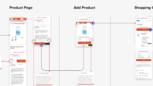
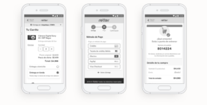
 Mid fidelity wireframe example
Design Challenges
Some of the critical challenges in terms of interaction design that the product team faced were:
- Payment method scenarios & edge cases
- Retter’s business rules and logic for credit (including online payment/account information).
Continuous testing and iteration were critical to manage risk and avoid investing in features that wouldn’t result in meaningful business impact for Retter.
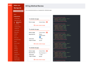
 Usability testing session example
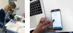 Usability testing session example
Final Product
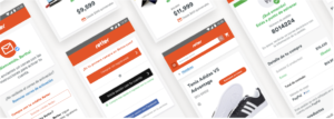
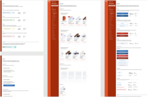
 High fidelity mockups example
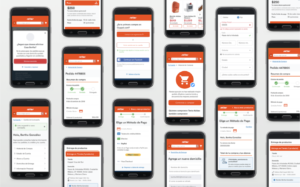 High fidelity mockups example
By the end of the project, the product team designed more than 20 customer journeys, including:
- Account management
- Home page
- Filterable product list
- Product details
- Shopping cart
- Checkout process
- Address
- Payment
- Summary
- Confirmation pages
Responsive Design
 Example of a screen for desktop view
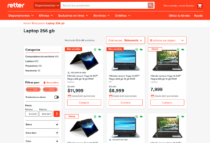 Example of a screen for desktop view
Although 80% of the traffic of Retter was through mobile devices, the responsive behavior for tablet and desktop was also designed leveraging fluid layouts.
Design System
 Design System preview
 Design System preview
The UI team along with the front-end team developed a design system with reusable components throughout the project as a means to standardize the visual language across different experiences such as mobile apps, and also speed up the development process and time-to-market for potential new products while driving a consistent digital experience for Retter customers.
We defined a governance framework for creating, socializing, and maintaining the design system:
- UX contributors providing use cases and mid-fidelity wireframes as input for the design system
- UI contributors were the main drivers of the design system, creating and document components, guidelines, and best practices
- The front-end team made a living style guide with snippets and components ready for use.
Live Style Guide
 Example of components on the design system
 Example of components on the design system
Both the design and development made accessibility a first-class citizen in the design system, ensuring enough contrast in colors, adequate sizing of components and typography, and tagging elements for an optimal screen reader experience.
Project Outcomes
We increased the conversion rates of Retter through A/B testing. Also, we handed off all the design artifacts and worked with the development team to implement them and iterate in light of new evidence of customer behavior.
In summary, we achieved:
- Improvements on more than 90 screens of Retter.com
- On average, we saw a 5% increase in sales revenue on Retter.com after implementing the new design and user flows
- We improved Retter’s design team fluency in Agile and UX
- We provided Retter with a scalable, omnichannel design system
- Merger of commerce and customer banking experiences (including payment and credit complexities)
About Wizeline
Wizeline is a software development and design services company with operations in the U.S., Mexico, Vietnam, Thailand, Australia, and Spain. Wizeline partners with global enterprises and scaling startups to build end-to-end digital products. If you’d like to learn more, please visit www.wizeline.com or check out more case studies.
If you would like to learn more about our services, please contact us through the form above or schedule a call here.
Other Case Studies
How Wizeline’s AI Academy Catalyzed Generative AI Innovation in Mexico’s First Hackathon
Read more >>

Helping a Major Media Enterprise Increase Article Visibility with a New Web Rendering Platform
Read more >>


Leveraging MLOps to Deliver Improved Predictive Analytics for a Supply Chain Analytics Company
Read more >>
Helping Etsy Migrate Its Data Warehouse From On-Premises to Google Cloud Platform With No Downtime
Read more >>